Diagram-as-code tools only inch towards the visibility we need
If you need a continuously updated, real-time view of your system, one that evolves with your architecture instead of becoming obsolete, a new generation of truly interactive tools is the way forward.

Software architecture is the backbone of any successful project. Architects, DevOps engineers, and platform teams need effective ways to visualize complex systems, align stakeholders, and facilitate collaboration. Diagrams play a crucial role in quickly getting everyone on the same page before jumping into code, minimizing misunderstandings and reducing rework.
With advancements in AI, there's been an explosion of tools designed to create interactive system design diagrams, building on the diagram-as-code trend that has gained traction in recent years.
Diagram-as-code has been a game-changer for developers, allowing them to generate and manage architecture diagrams directly from plain text or code syntax. It eliminates the need for drag-and-drop whiteboard tools, enabling teams to version control diagrams, integrate them into CI/CD workflows, and generate them programmatically.
While diagram-as-code tools excel at generating diagrams, but they don’t solve a key challenge: keeping them up to date as the system evolves.
And this is where we need to shift the conversation. Automation in diagram maintenance is the missing piece, one that OpenTelemetry-based system visualization tools are now tackling.
Diagram-as-code tools
Developers have always sought ways to visualize system architecture, especially in complex projects where diagrams clarify relationships between components far better than written documentation ever could.
From the earliest tools in the 1980s, such as CASE (Computer-Aided Software Engineering) tools which could generate diagrams from code in structured programming environments, to UML (Unified Modeling Language) tools in the 1990s (that could reverse-engineer code into diagrams) software teams have long experimented with code-driven visualization.
For a while, drag-and-drop diagramming tools dominated: Visio, Lucidchart, Draw.io, and others. While useful, they introduced significant challenges:
- Manual effort: Adjusting boxes and arrows in large projects is time-consuming.
- Lack of version control: No easy way to track changes or collaborate effectively.
- Limited integration: No direct connection to code repositories or automated workflows.
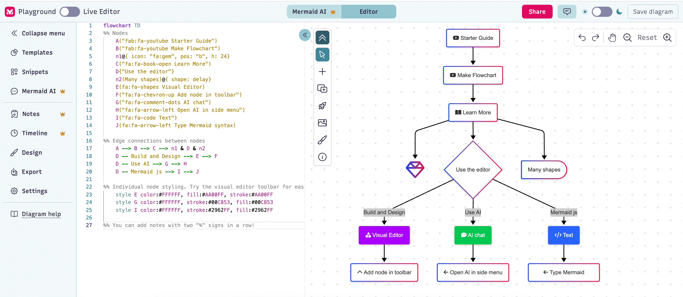
That’s why diagram-as-code (DAC) tools have gained traction: Mermaid, PlantUML, Diagrams and many others. Whether labeled as text-to-diagram tools, diagramming notations, or code-generated visualizations, they all serve a similar purpose:
- Version control & automation: Diagrams are stored as code, allowing tracking, diffs, and automation in CI/CD pipelines.
- Integration with development workflows: Developers can embed diagrams directly into documentation, wikis, and even codebases.
- Concise syntax: Rather than manually drawing, developers describe system components and relationships in a structured format, making diagrams easier to maintain and regenerate as the system evolves.
Most importantly, diagram-as-code makes architecture diagrams more accessible to the entire engineering team. Clear, visual representations of complex architectures, database schemas, and process flows remain one of the most powerful tools for communication and alignment in software development.
Why diagram-as-code tools are not enough
Diagram-as-code tools are a significant improvement over traditional drag-and-drop diagramming, offering faster and more accurate system visualizations. However, they still suffer from a fundamental limitation: they remain static snapshots of your system.
While these tools integrate better with development workflows, they don’t address one of the biggest pain points in system architecture: keeping diagrams in sync with reality.
Yes, you could build automation pipelines to regenerate diagrams as your software evolves. You could even develop custom tooling to maintain architectural documentation dynamically. But let’s be honest: most teams don’t have the bandwidth to engineer and maintain such a system alongside their actual product development.
Ultimately, if you add a new service to your system, if an API change, if your architecture evolves, you need to update your Mermaid.js or PlantUML diagram code yourself.
There are other drawbacks as well:
- Diagram-as-code diagrams often lack critical context: such as design decisions, trade-offs, and environment-specific details. Without this information, teams still need to manually track and document key aspects of the systems’ evolution.
- Most diagram-as-code tools focus only on visualization. Some may include documentation features, but few (if any) support other tools an engineer needs to understand a distributed system in real time, across all layers of the stack.
The bottom line is that diagram-as-code tools are a step forward from whiteboarding tools, but they don’t fully solve the problem of system visibility.
Engineers need more than just static diagrams. They need living, automatically updated views of their systems that provide real-time insights into architecture, dependencies, and system behavior.
Truly interactive diagramming tools
The need to visualize a system is, at its core, about understanding how it works so developers can safely make changes, troubleshoot issues, onboard new team members, plan for technical debt, or navigate dependencies in complex architecture.
This is why a real-time visual representation of your system, one that accurately mirrors its current state, is such an incredibly powerful tool for faster decision-making and safer development.
Many tools claim to be "interactive," implying that they support this level of visibility into your system. However, that word can mean very different things. Ask yourself, does "interactive" mean…
- AI-assisted suggestions and modifications?
- Real-time multi-player collaboration on a shared canvas?
- That the tool is actually connected to your live system, dynamically updating as your software evolves?
Most tools focus on the first two definitions (AI-powered tweaks or multi-player editing) but very few offer true interactivity, where the diagram itself is a reflection of the system as it runs.
Multiplayer's approach to real-time system visualization
True system visibility requires moving beyond static diagrams (even code-generated ones) to representations that evolve automatically as your system changes. This is where leveraging observability data becomes transformative.
Multiplayer takes a fundamentally different approach: rather than asking you to describe your system architecture in code, we automatically generate and continuously update system visualizations from your existing OpenTelemetry data.
Your system documents itself
Every service call, every API request your system makes is already being captured by your observability infrastructure. This telemetry data contains a complete, accurate picture of how your distributed system actually behaves in production.
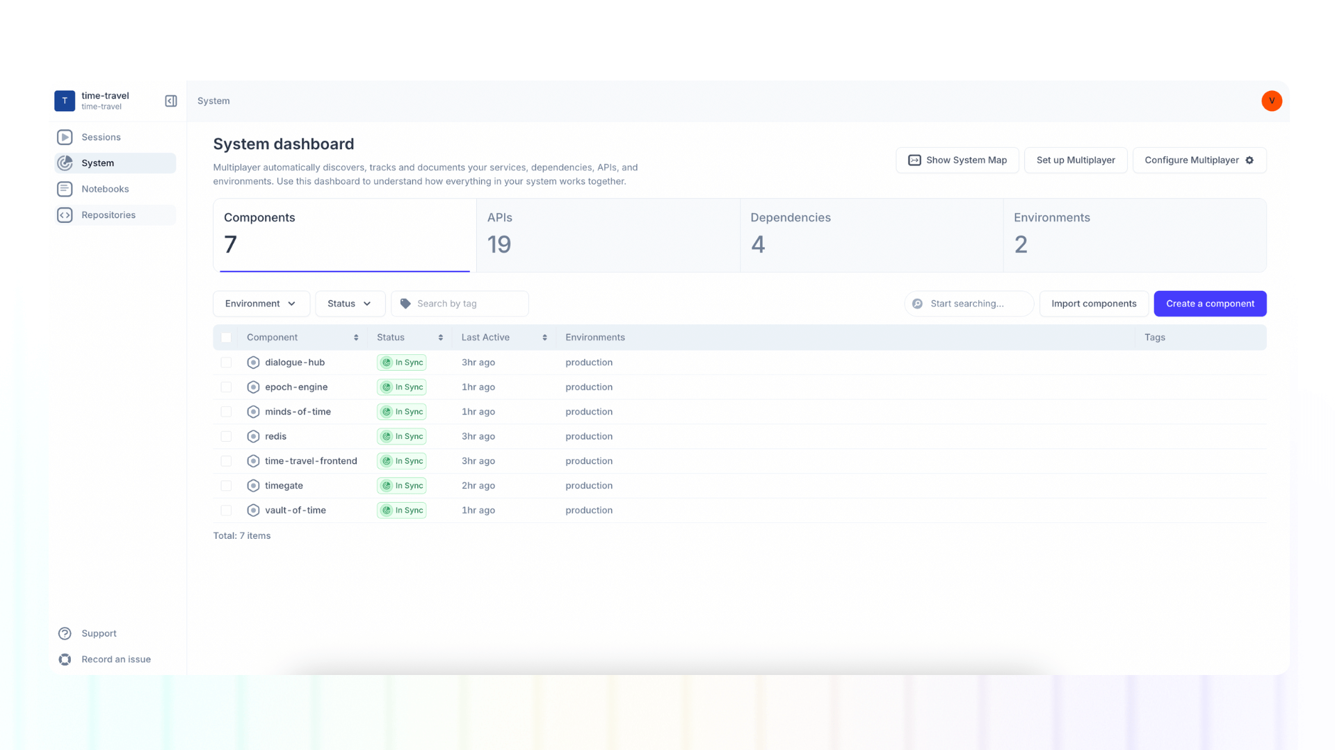
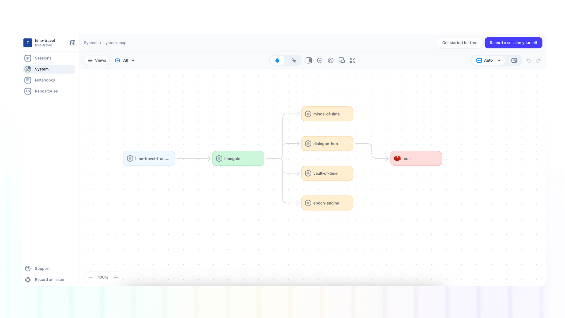
By analyzing this OpenTelemetry data, Multiplayer automatically generates comprehensive system tables and diagrams that show:
- Service topology and how components communicate
- Dependencies on databases, APIs, and third-party services
Always current, never stale
The key difference from diagram-as-code tools is continuous automation. Deploy a new microservice? It appears in your system diagram automatically. Change how services communicate? The visualization updates immediately. Remove a dependency? It disappears from the view without anyone needing to update a Mermaid file.
This eliminates the fundamental problem with all manual documentation approaches: they become obsolete the moment something changes. With automated generation from actual telemetry, your system visualization is always accurate because it's always derived from reality.
Context beyond the diagram
While the visual representation provides critical architectural context, Multiplayer goes further by connecting system-level visibility with session-level detail. You can navigate from the high-level architecture view to specific user sessions that exercised particular services, seeing exactly how requests flowed through your system for real users.
This combination of macro and micro views solves problems that diagrams alone cannot:
- Debugging: Trace an issue from the user experience through the service topology to identify bottlenecks or failures
- Impact analysis: Understand which user journeys will be affected by changes to a particular service
- Onboarding: Give new engineers both the architectural overview and concrete examples of how the system operates
- Planning: Make informed decisions about refactoring or scaling based on actual usage patterns, not assumptions
The power of automated, living documentation
Traditional diagram-as-code tools ask: "How can we make it easier to create and maintain diagrams?" But that's still fighting the same battle: keeping documentation synchronized with reality through manual effort.
The better question is: "Can we eliminate the need for manual diagram maintenance entirely?"
By leveraging the observability data you're already collecting, we transform system visualization from a documentation chore into an automatically maintained asset. Engineers get accurate, real-time insight into their distributed systems without writing a single line of diagram code or updating a single configuration file.
This is the future of system visibility: not asking developers to describe what they built, but showing them what's actually running, continuously, accurately, and without additional effort.
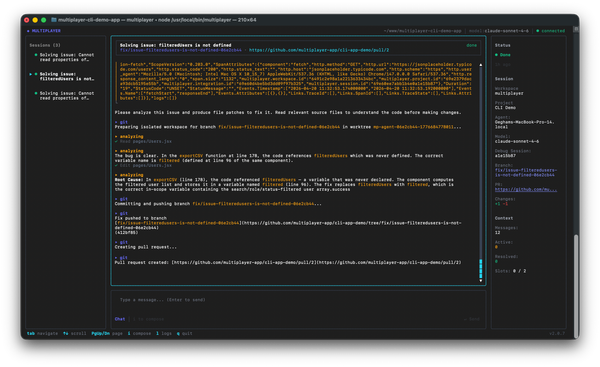
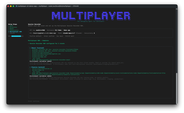
One copy/paste in your terminal and the debugging agent is running:
npm install -g @multiplayer-app/cli && multiplayer
Rather explore first?👇